— Case Study
Redesigning a pipeline for sales renewals, implementing a new design system.
Deliverables:
UI/UX
Design System
Prototyping
User Testing
Developer Handoff
TL;DR
This case study covers a UX-led redesign of Better Agency’s Renewal Pipeline, using low-lift, high-impact updates to improve the experience within tight resource constraints.
The Product
Better Agency's (BA) SaaS product is a CRM for independent insurance agencies. A niche market made of small teams and fairly conservative budgets, agencies need industry-specific features in order to successfully run their business.
This case study focuses on BA's Renewal Pipeline, a feature used by insurance agents to manage upcoming policy renewals with existing customers, in hopes to retain their business YoY.
The Problem
As the CRM was originally bootstrapped, the application has many features in need of a makeover. An ongoing priority from leadership is updating prioritized features with our new design system, and improving the user experience in that process. The "fun part" is that we often have limited development resources to do so. Because of this, we have to get a little creative. Our solution is "Quick Wins" = identifying improvements that are low lift for design and development, but will have a high impact on the user experience.
My Role
I owned this project end-to-end, including a feature audit, user feedback sessions, UI updates with implementation of our new design system, prototyping, user testing, and annotations for developer handoff. I also owned the research that justified this project. That's covered in this case study if you're curious.
I'll admit, before I took this role, I knew nothing about insurance. Over time, I can now speak the lingo, and often with our friendly, down-to-earth customers I enjoy meeting with for early concept and prototype testing. I don't think they're sick of me yet ;).
This case study showcases the all-too-often, real-life scenario of having to balance business priorities, limited resources, and user needs.
UX Audit
To begin this project, I needed to understand this feature very thoroughly, so I completed a UX audit. Here's a snapshot of that process:
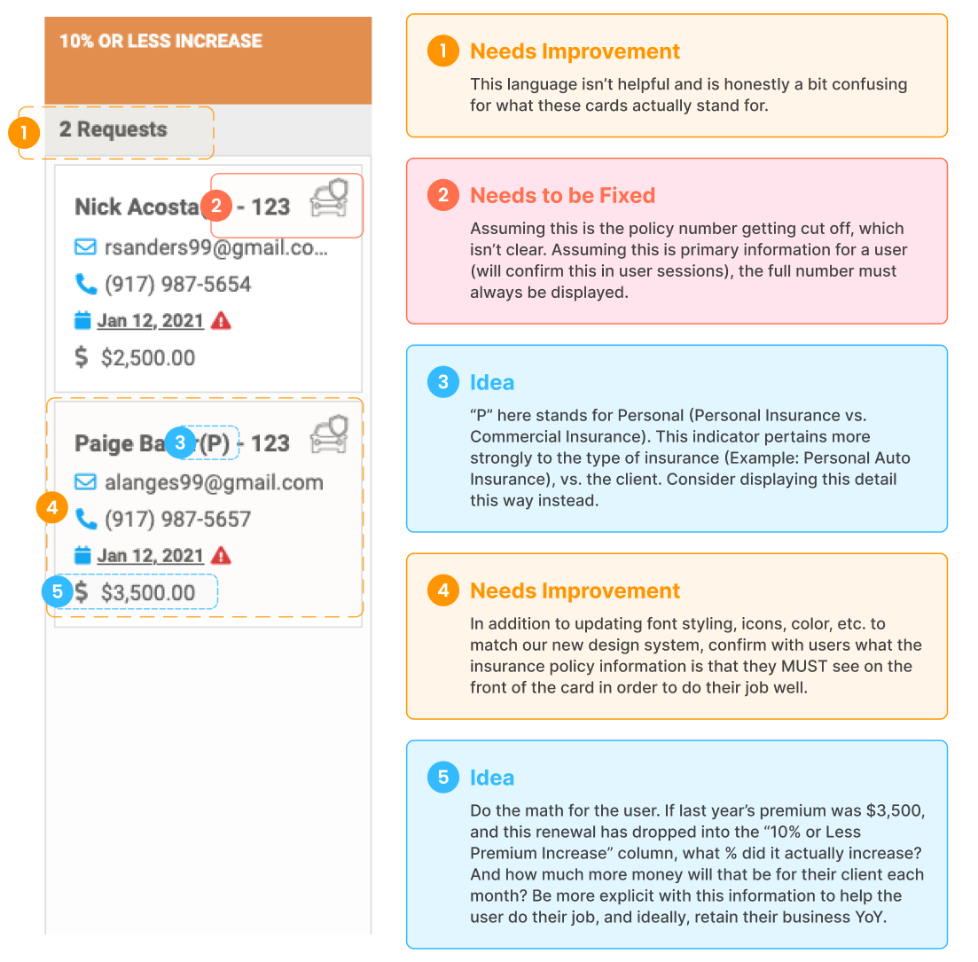
From here, I led user feedback sessions with existing customers to understand what was working for them vs. areas that caused them more work or frustration.
Design
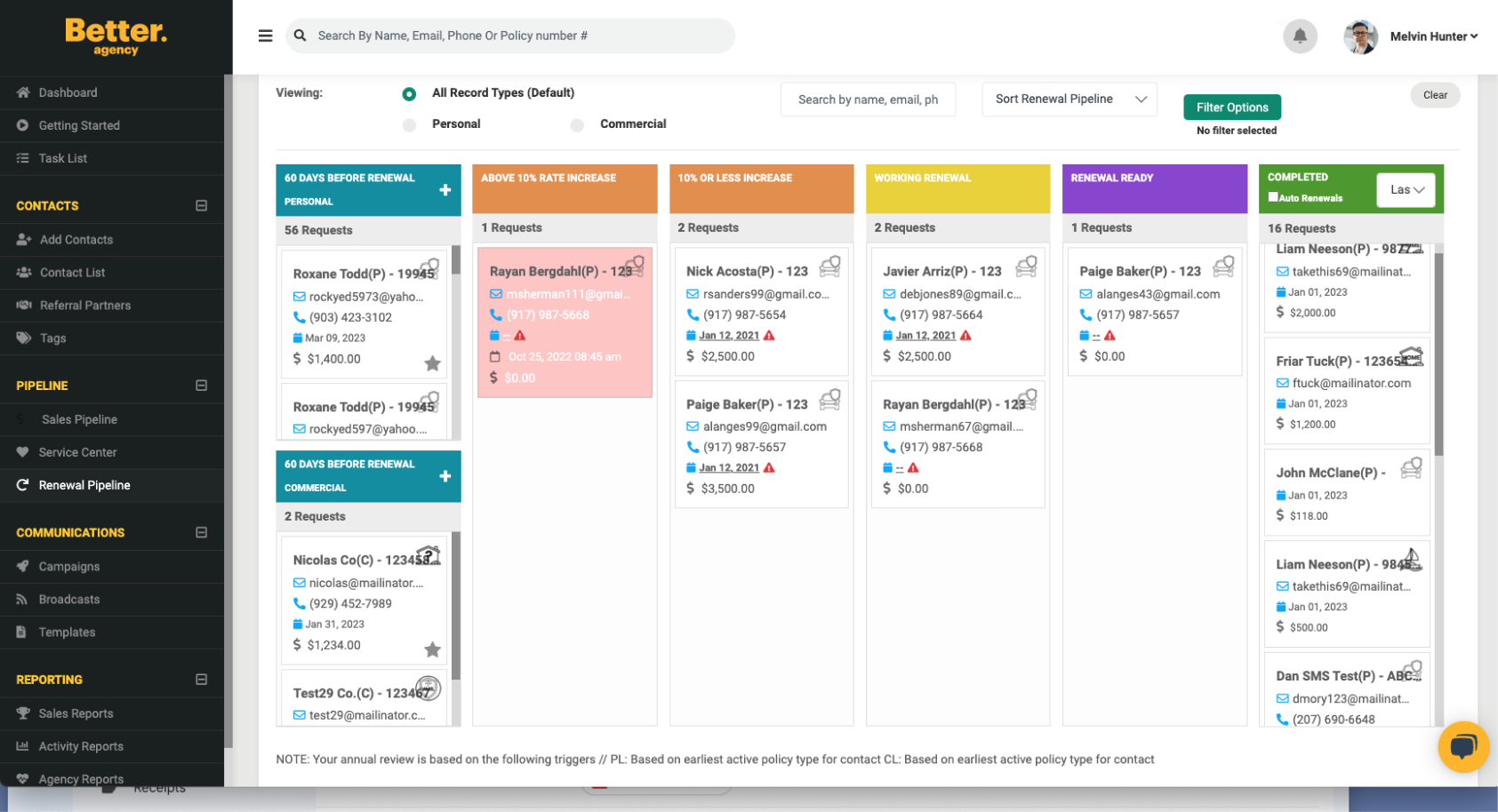
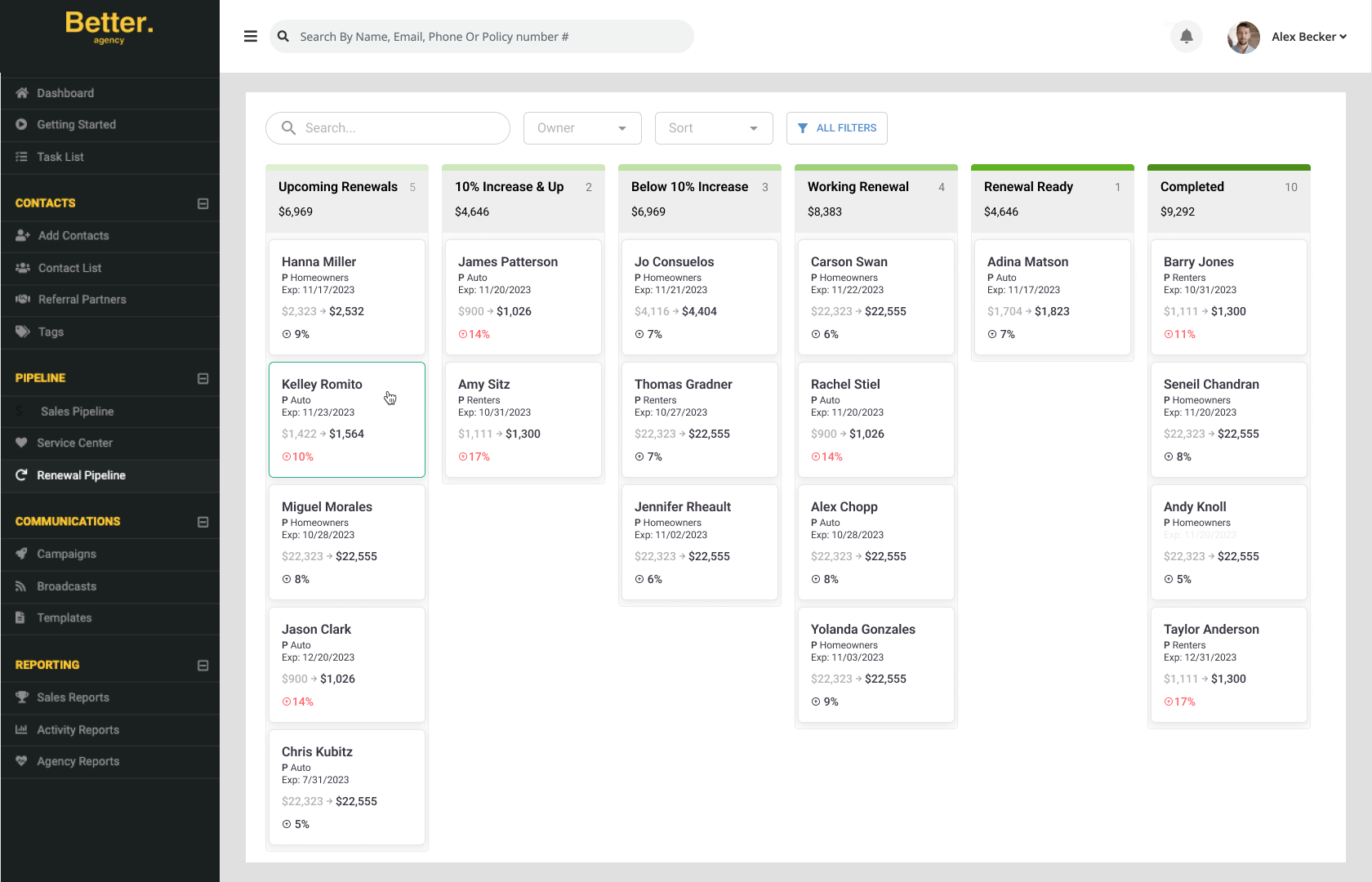
Once I had a grasp of users' pain points and desires and while keeping resource limitations in mind, I began redesigning the pipeline, implementing our new design system. Below is a before & after comparing the old landing page view vs. the new (more details below).
Diving Deeper — Quick Wins for us, Bigger Wins for users
Given the development time limitations for this project, how might we discover and execute fast UX wins in the design process that would improve our user's Renewal Pipeline experience?
How
Insurance policies that will soon expire automatically drop into the renewal pipeline, designed as policy cards. Once a policy is in the pipeline, the user begins “working the renewal.” This involves contacting their customer and understanding current insurance coverage needs. As the agent works with their customer, they move the policy through the pipeline until it’s complete. While the goal is for the customer to renew, an equally positive end result is a rewrite — which means the customer still wants coverage through the agent but their coverage needs have changed, so they need to "re-write" the policy. The final and bad-news-bears renewal status is "lost." As you've likely guessed, this means the customer found coverage elsewhere and as a result, the agent has lost the client.
Why
While time spent on selling new business usually leads to financial gain, our most successful agencies put just as much attention into their renewal opportunities. (More on our most successful agencies here.) These agencies view their customers as long-term commitments. They foster their relationships instead of going all in on new prospects. Because of this fact, the renewal pipeline is an incredibly valuable feature, as it 1) alerts users about upcoming renewal opportunities, and 2) tracks the status and small details for each renewal process.
Based on our 'Why', which components should we focus our effort on to support the needs of our users?
1. Add meaning and consistency to the pipeline stages
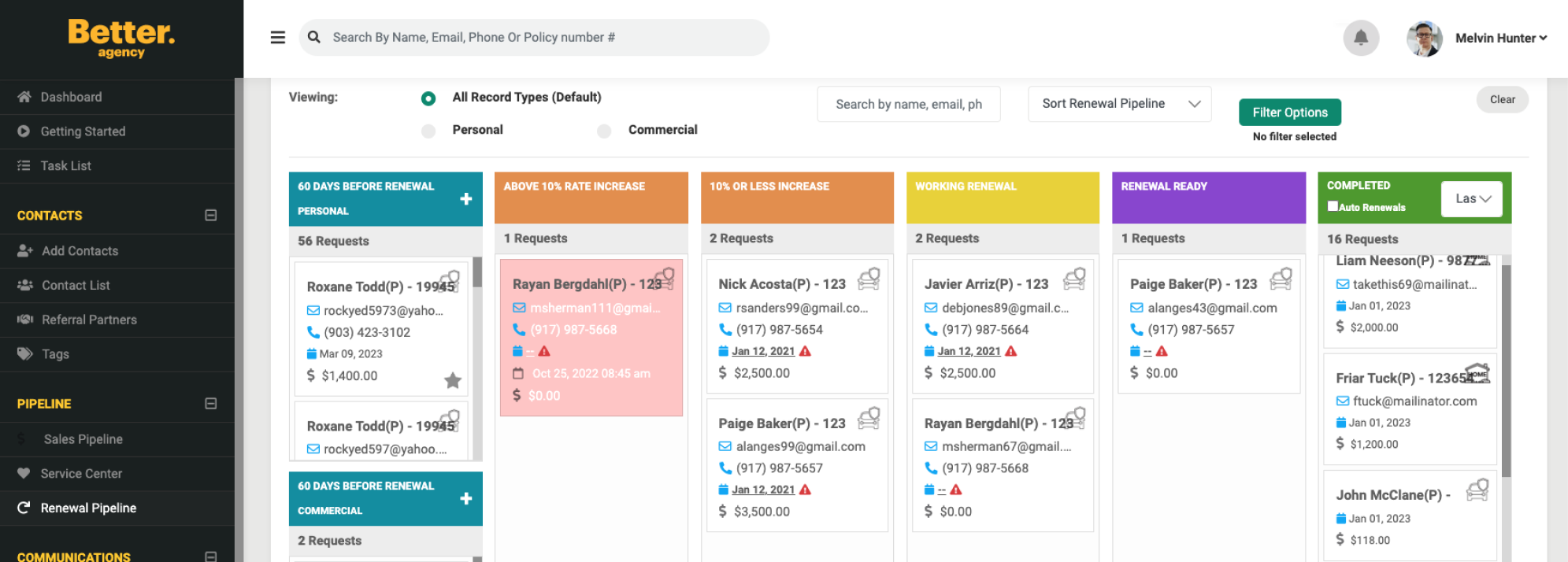
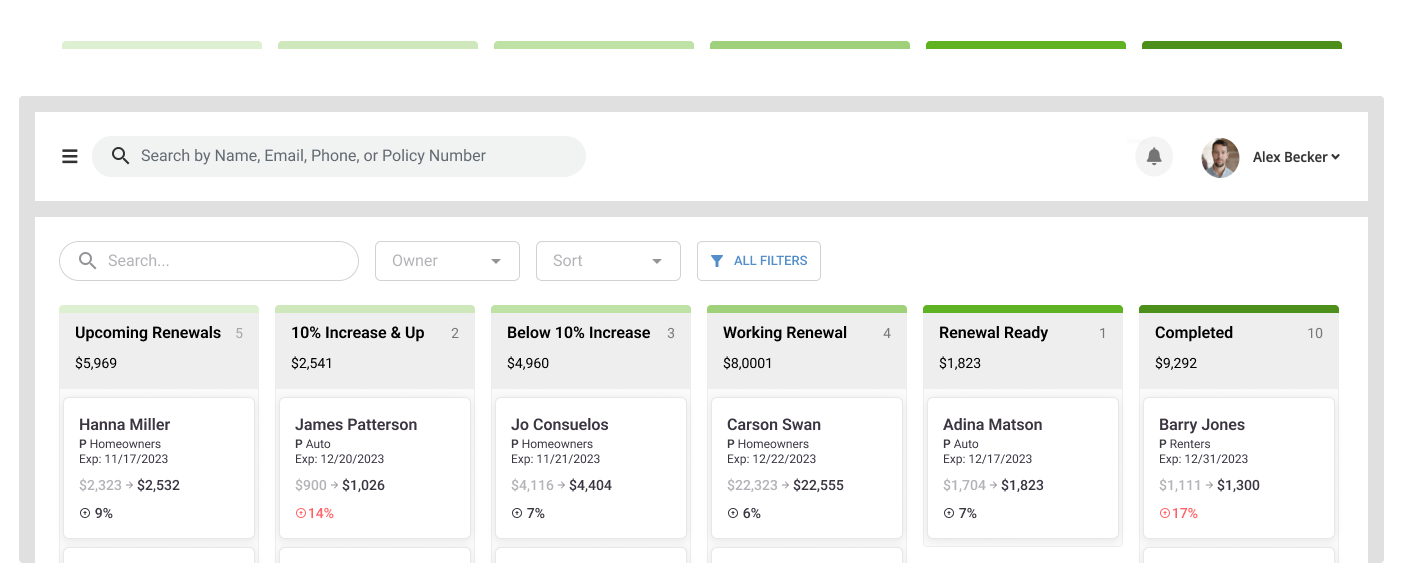
The search, sort, and filter designs were updated to align with our new design system. In addiiton, the color scheme used for each pipeline stage was changed to something that had more meaning. The increase in the green's saturation is like a stepping ladder to the completed goal. I also made some slight edits to the header names for consistency.
2. Prioritize the right information on the renewal cards

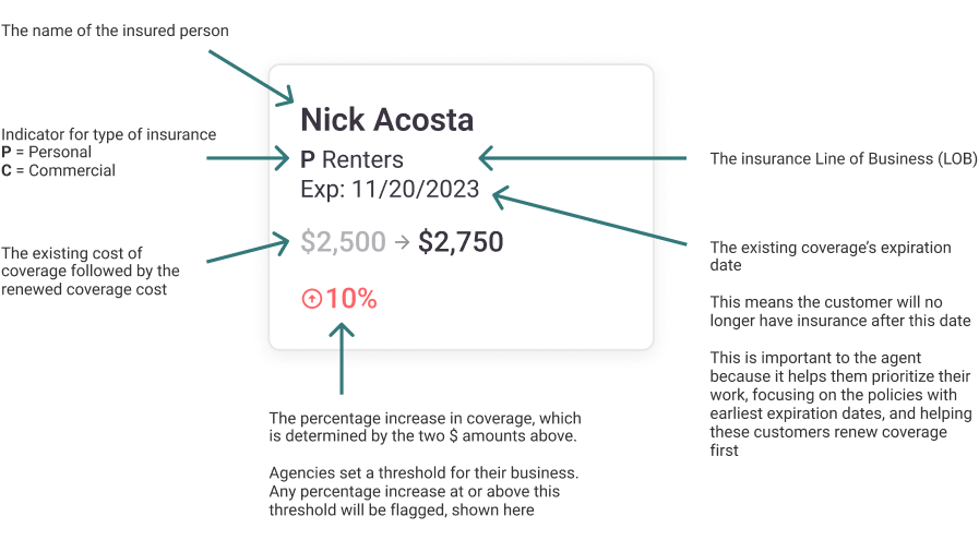
Our 1:1 sessions with customers increased my confidence as to what information was needed at-a-glance vs. behind 1 click. A main takeaway from these discussions was that a policy's expiration date and increase in coverage YoY was incredibly important. These details help an agent stay ahead of a renewal date and know if it will need to be re-quoted based on price increase. Though it seems small, these details help an agent retain their customer, which is huge. Alternatively, a client's contact information does not help them move a renewal through the pipeline, so it's ok for these details to live within the card. This finding provided new real estate on the front of the card for displaying the expiration date and coverage increase.
3. Provide increased clarity and transparency within the "Start Campaign" process

Each time a user moves a renewal card to the next stage in the pipeline, they have the option to begin the affiliated email campaign. The original modal provided little information. The user could not preview or edit the email copy, resulting in low confidence and hesitation. As one can imagine, sending an incorrect email to your customer can be pretty embarrassing.
The new modal makes campaign details and decisions surrounding them more explicit. If a user chooses to preview the campaign, they also have the opportunity to edit. Both of these functionality enhancements gave control back to the user, increasing their trust in the process.
Results
This project wrapped with me sending final designs and annotations to our development team. And then, as life often goes, our business priorities, and therefore product priorities, shifted. We are now in the midst of building an open API as well as a more complex integration with another system. After a few months of this project being stalled, I realized this didn't need to be an all-or-nothing situation. Users could still benefit from slow, small changes to the feature. I broke up the design updates into smaller sections and worked with our Product Manager and Engineering Manager to determine point estimates for each. We've been collaborating to to fit in 1 design section per product cycle, slowly but surely moving toward completion. Barring any additional changes, a full update for the feature should be complete late summer 2024. The reality of this priority shift is a great example of balancing user and business needs, and how satisfying both is achievable when you expand your thinking.